Index Creation Experience
Indexes can improve the performance of user queries but new users lack access to guidance on how. By providing an enhanced index creation experience, users will see what indexes affect which queries and gain a deeper understanding of the query/index relationship.
Opportunity
Team
Product Designer, Product Manager, Engineering, User Research
Timeline
10 week exploration and design
Project Type
Experiment (vs. Control)
Design Process (a short summary)
Understanding Past Research
We kicked off the project by looking through previous explorations into this opportunity. Another design team had done some concept testing related to our goal and the team took some time to go through the findings, highlight successes and understand unmet user needs.
Notable Concept Testing Findings:
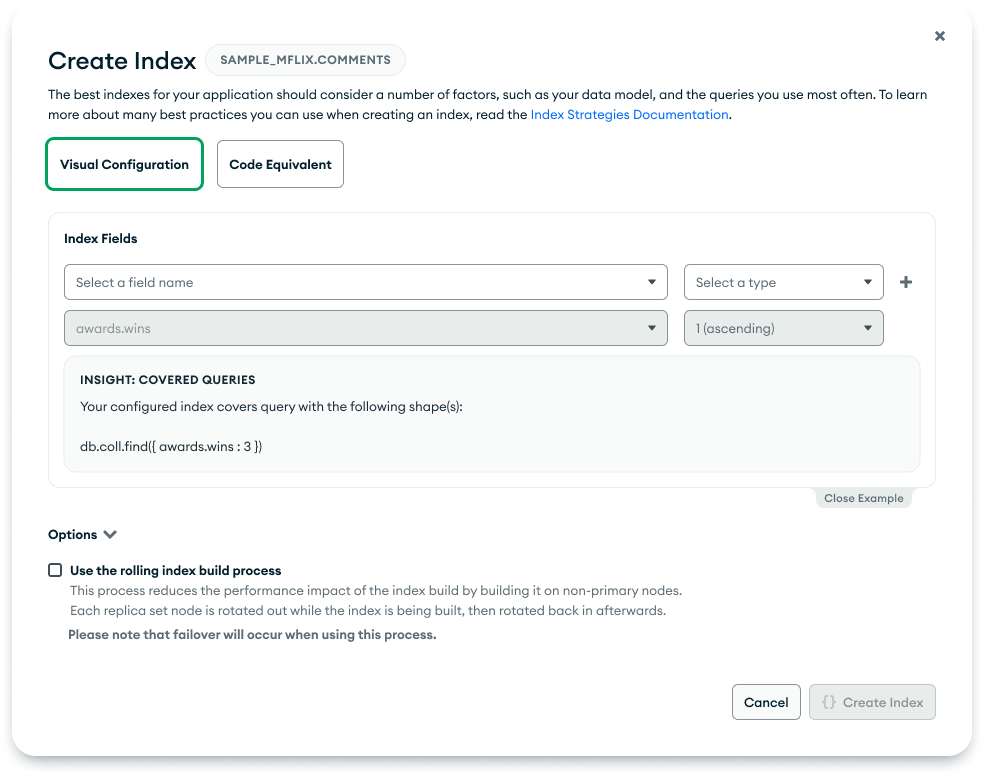
Users liked the idea of starting with a query and connecting it to an index
Users liked seeing code equivalent of an index
Ideas, Ideas, Ideas
I explored some concepts using mid-fi wireframes. During concept exploration I tried to keep in mind how I want the user to feel after interacting with the experience. Since we were targeting new users, I knew I wanted to build their confidence so that they leave the experience feeling even more comfortable in using our product. Our users tend to be action oriented and learn by doing, so our concepts revolved around noting user action triggers and surfacing relevant next steps at the right time.
Pros
We kept the majority of the current experience the same here (quick engineering effort)
Added an insight button that would show what queries were addressed on hover (guidance without feeling too educational)
Cons
Awkward placement for the insight and makes the modal feel crowded
Not a common pattern for insights and tips in our product

Pros
Clear separation between index fields and index configuration (optimization of current experience)
Closable insights (guidance without feeling too educational)
Cons
Still busy looking! The priority of user actions isn’t clear

Pros
Clear relation between the input index and the queries it covers
Optional optimization to include both translations from query to index and index to query
Cons
Changes a lot of the current modal so it’ll be a bigger design and engineering lift
Changes the vibe of the modal from task oriented to a guided experience which might turn some advanced users away
After the first round of design reviews, we narrowed in on including these features:
Code Equivalent for Indexes
Vice Versa Translations (Index —> Query and Query —> Index)
What Can We Do vs. What Should We Do
It’s important to me to involve engineering as early as possible when designing a new experience. It helps me narrow my focus and understand my design limitations. When going over the above prioritized features we came across these engineering limitations:
Algorithm to accurately suggest an index is limited and the input query needs to be very precise
Front-end revamp would be a big effort and required collaboration with the team that owns the current modal
There were a couple more engineering focused limitations that wouldn’t affect design as much but still required some back-end exploration. Understanding this I brought in engineering representatives at the week 2 mark once I understood our feature priorities. In our collaborative meetings, we try our best to balance what we can do vs. what we should do. Our goal is to align on a concept that is feasible to build while accomplishing our user needs and goals.
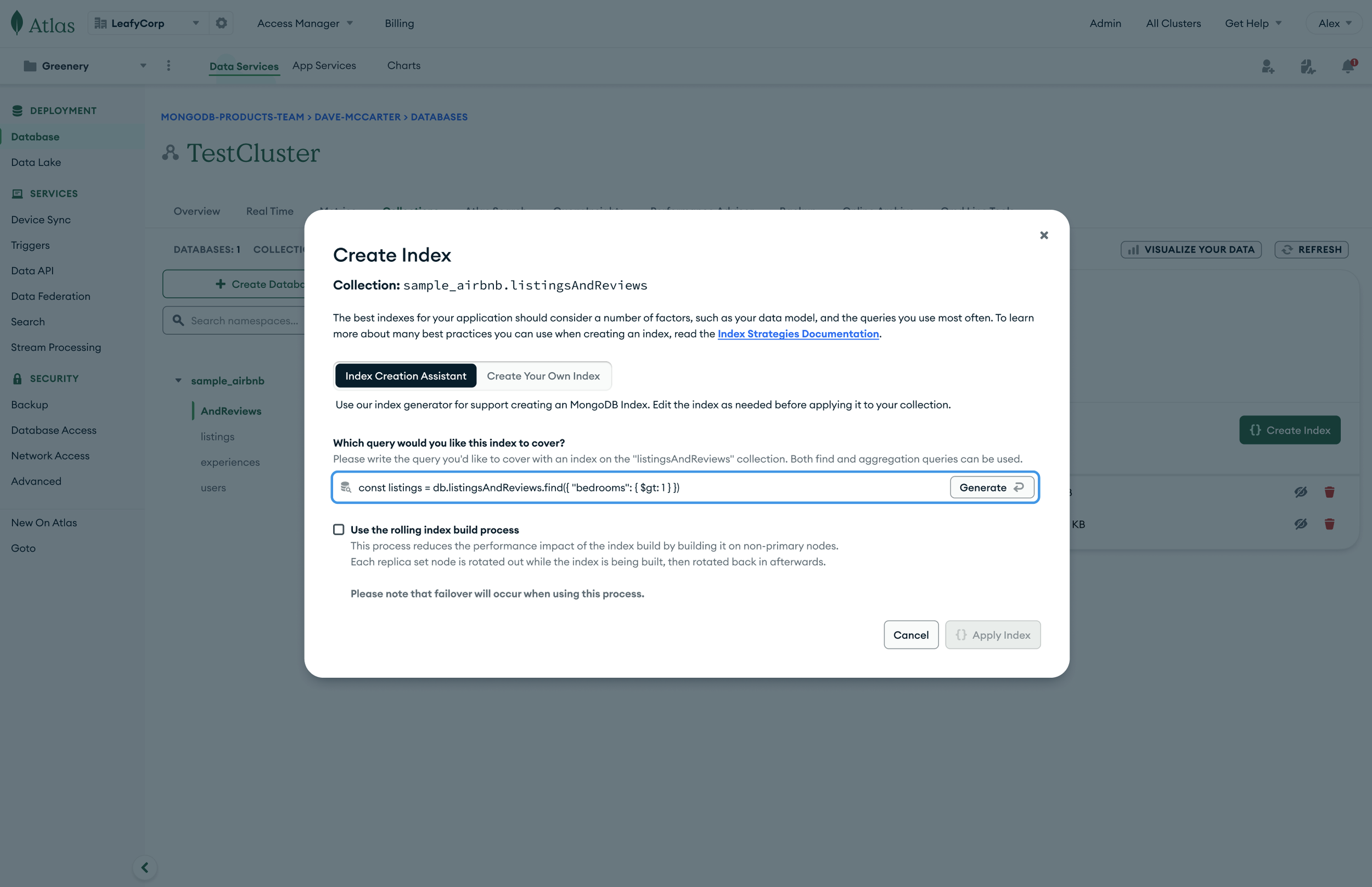
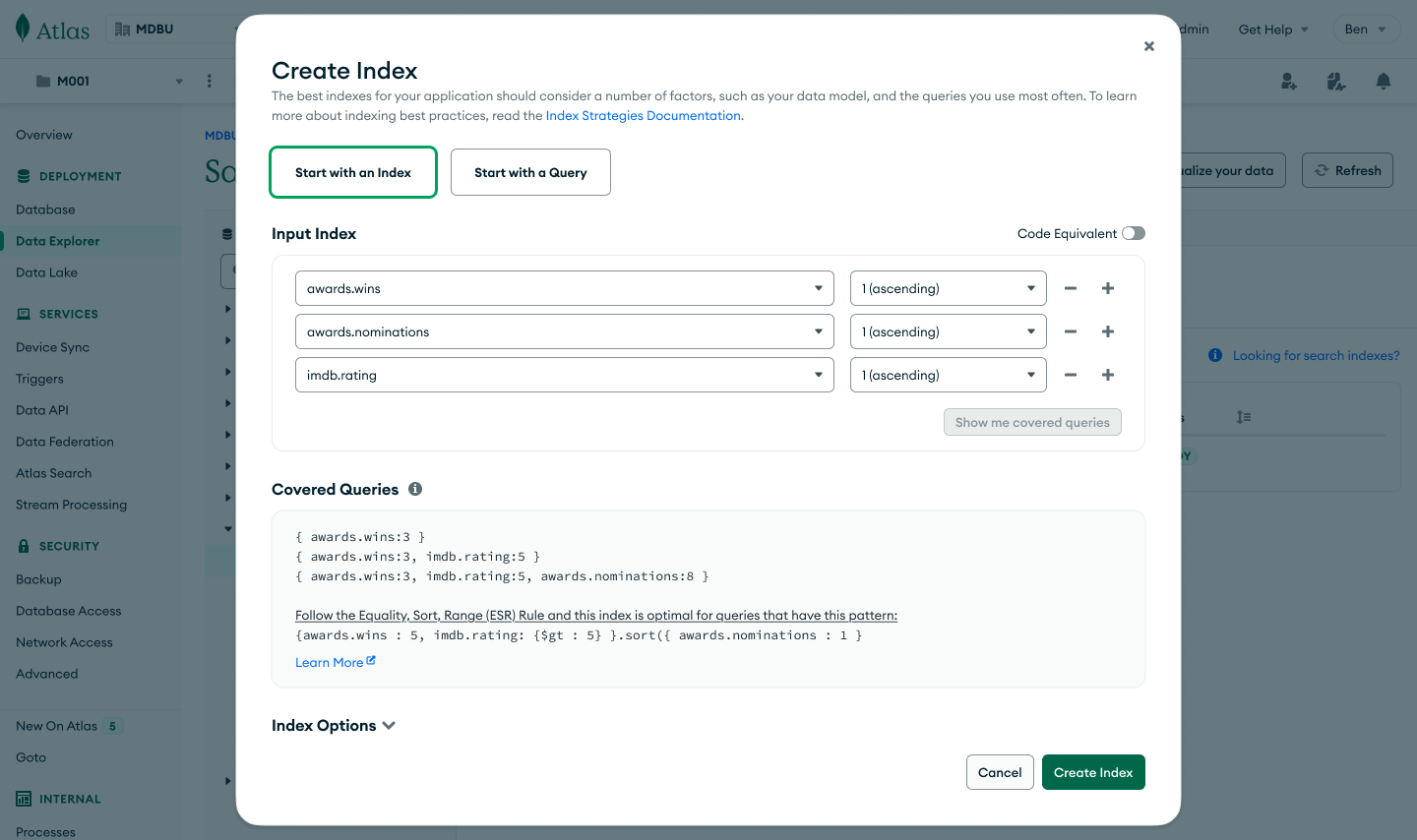
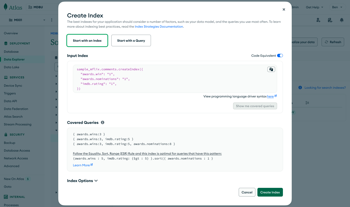
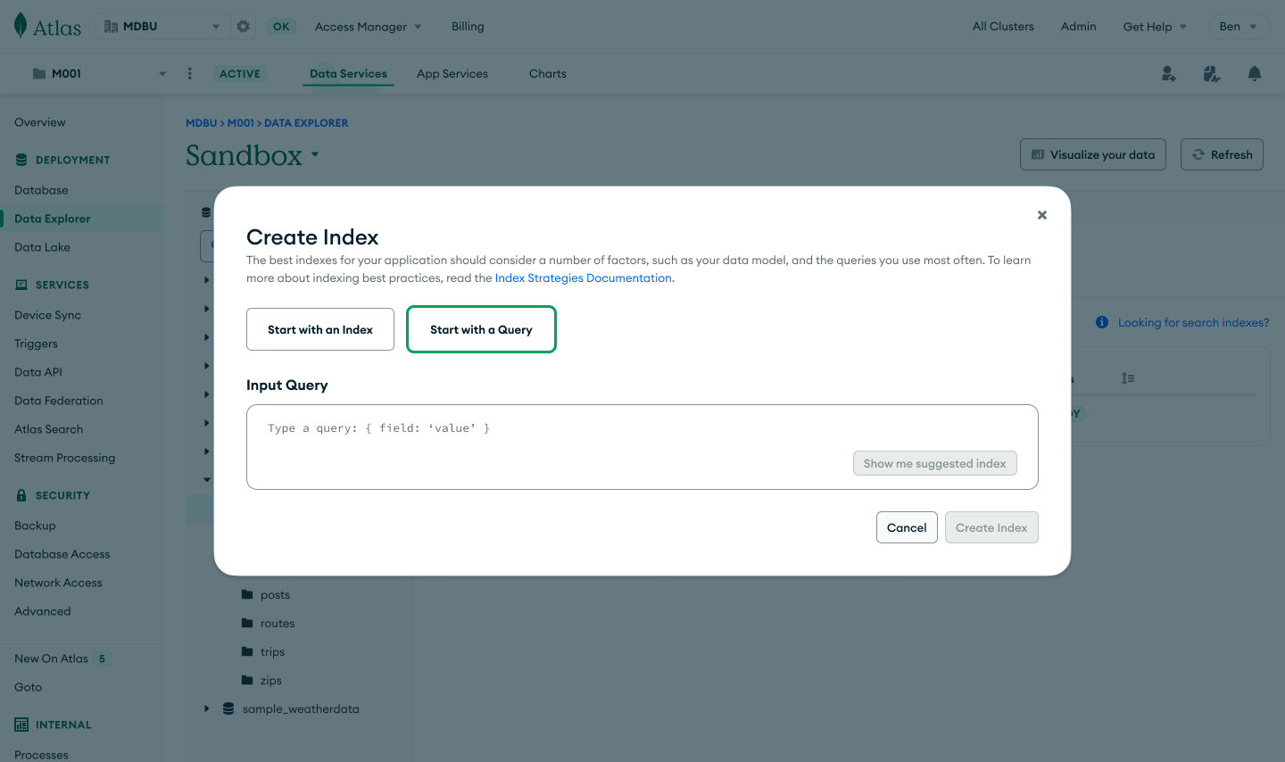
In this happy path, the user starts with an index and gets to see what queries would be covered if they created this index.
Instead of the top level selection being “Visual Configuration vs. Code Equivalent” I changed it to “Start with an Index” vs. “Start with a Query". This felt more aligned with the user’s mental model and the first decision they’d need to make to successfully interact with the modal
I made the code equivalent of the index accessible but did not default to it so that the experience wouldn’t be intimidating for new/beginner users
I decided to disable certain buttons until a user inputs and interacts with the drop downs so they know the order of actions they need to complete to move forward
I went through several iterations (it’s Tetris honestly) of moving around the different elements on the page. I struggled especially with the radio buttons. Originally I had a segment selector component that spanned the length of the modal to signify that everything below it changed with the user’s selection on the segment selector. However after conversations with design systems and our engineers, we decided it did not align with how the component should be used
Finalized Index to Covered Query Concept (Happy Path)


Finalized Query to Index Recommendation Concept (Happy Path)
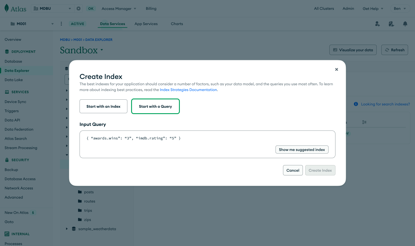
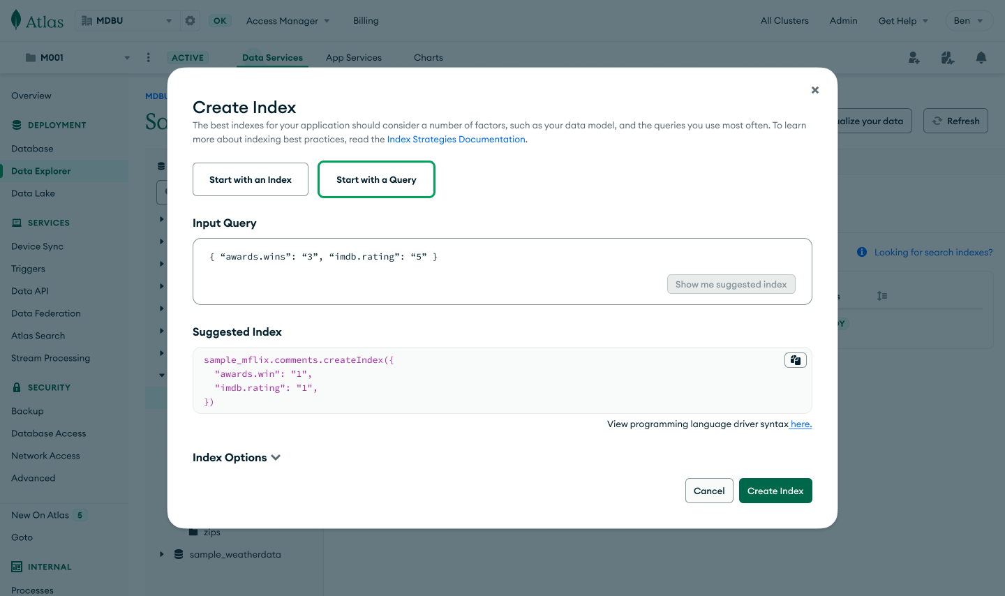
In this happy path, the user starts with a query and is provided with a suggested index to create.
I defaulted to displaying the suggested index in code form. Since the user would not be able to change the suggested index the drop downs didn’t make sense and displaying the index in words is very similar to the code version of it. To make things simple I decided to just show the code equivalent
Similar decisions about disabled CTAs were made as above
Further Optimizations
Since this was an experiment we were limited to an MVP idea. If the experiment is successful I’d like to explore a version that easily switches between inputting an index or query. There are a lot of moving parts and the experience feels disjointed at times. My inspiration was the translation tool on Google and I want to emulate a similar easy and streamlined feel.
There’s also the topic of entry points. Since this is an important part of the user journey (a point that indicates to us they’re high intent on continuing to use the product) we want to support them in getting into this modal. We used existing experiences as entry points here (an existing insights pattern for example) but it would be interesting to consider how to surface this to the user at the right time in other ways.
Outcome + Next Steps
Observe
This project has been built and we’re closely watching the numbers. There were some hiccups on the engineering side because of the algorithm they created so the experiment was momentarily paused. However, it has been put back up.